How to select good color combinations:
Choosing the right colors for your Menu design can be a daunting task. One effective approach is selecting adjacent colors from any color palette available in the internet sources. Let us dive into the principles and benefits of this technique.
We explore
- Understanding Color Palette
- Tools and Resources
- Psychological Impact
- Practical Tips and Examples
Understanding Color Palette
A color palette is a collection of colors chosen to be used together in a particular design, artwork, or project. These colors are selected based on their aesthetic harmony, the emotions they evoke, and the overall visual impact they create.
It is essential for any visual creative work, helping to ensure that colors work well together and achieve the desired aesthetic, good looking and emotional impact.
If you are an artist, you can easily choose good color combinations to produce good looking Menu. But most of the normal peoples couldn’t do this. So, this article will help you to choose better color combinations for your menu and impress your customers well.
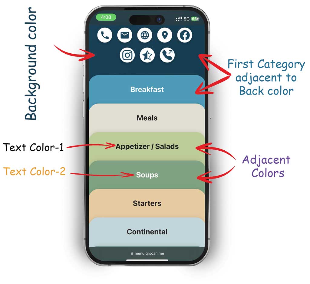
- First choose your Menu background color based on your logo color. This is a part of branding your menu.
- Next, Pick a color for your first category. Keep it in mind; your first category is adjacent to background color, so find your background color in the color palette and choose nearby color for your first category. you can see different combinations based on mood and emotions.
- With reference to your first category color, choose next color for adjacent category from the color palette. Repeat this up to last category.
Tools and Resources
Color palette tools are digital resources that helps you to select, create, and manage color schemes for your design. These tools simplify the process of finding harmonious colors for your menu design. You can search the keyword ‘color palette’ in the web search engine and can find any suitable one. Here are some popular color palette tools and their key features:
Color Hunt: https://colorhunt.co
Key feature: A collection of curated color palettes, the ability to browse and save favorite palettes, and a focus on trending color schemes.
Color Mind: http://colormind.io/
Key feature: AI-driven palette generation based on user preferences & extraction of palettes from images.
Color Space: https://mycolor.space/
Key feature: Generates palettes from a single base color, offers gradient options, and provides instant previews of color combinations.
Psychological Impact
Understanding the psychological impact of color is essential for effective design, marketing, and communication, as it helps create desired emotional responses and influences how people perceive and interact with your menu.
Restaurant menus often use color to highlight certain items and influence choices. Red can draw attention to specials or high-profit items, while green can highlight vegetarian or healthy options. Moreover, customers should be satisfied when looking at your menu, so avoid dark color combinations and try to pick pastel colors instead. This will make customers feel calm and create a more relaxed environment.
Practical Tips and Examples
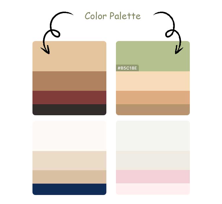
Let’s see an example of choosing a good color combinations for QR-Menu using color hunt.
- First select a primary color for Menu background, Eg:- dark blue, usually this is chosen based on your theme or logo color (refer the above picture).
- Now visit color hunt website (https://colorhunt.co) and search for this color (dark blue) and you can see more than one palette with the same color. So, choose any one adjacent to the dark blue. this is your first category color.
- Copy this color code by hovering your mouse over that color, you can see the HEX code of the color (eg: #4E99B8), click it for copy
- Open your QRSCAN admin dashboard, edit your restaurant menu, open second page (Design QR code), then edit first category and paste this color in HEX field of Background color.
- And choose Text color, which is opposite of the selected background color, eg:- choose Black text for light background color or choose white text for dark background color. so that the letter will be visible clearly.
- Now take the first category color as reference color and search another adjacent color from the palette as same as above steps upto last category color.
-OR-
You can use Color Mind to generate color palette from your logo images.
- Visit Color Mind (http://colormind.io/image/)
- Upload your image (theme image or logo)
- Color palette will be auto generated or click ‘Generate’ button to re-generate palette.
- Copy color code near each color and paste it in each Menu category background color HEX field
Done.!